OGGETTO
LOCALIZZAZIONE
DATAZIONE
AUTORE
STATO DI CONSERVAZIONE
MODALITÀ DI CONSERVAZIONE
RESTAURI
ISCRIZIONI
STEMMI, MARCHI
NOTIZIE STORICO-CRITICHE
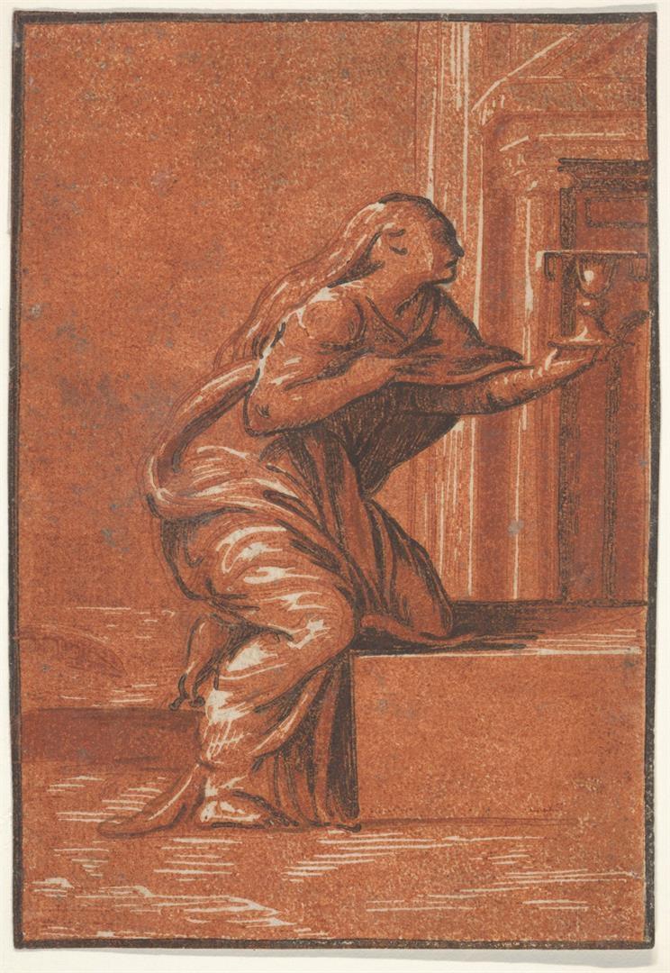
Chiaroscuro woodcut from 3 blocks, light red, red, black; only state Faith is one of six chiaroscuro woodcuts, similar in size, style, and technique, identified by Bartsch as the Christian Virtues; the other five are Hope (ALU.1004.1), Charuty (ALU.1005.1), Fortitude (ALU.1006.1), Temperance (ALU.1007.1) and Prudence (ALU.1008.1). Parmigianino was traditionally credited with the designs, despite the absence of modelli by his hand (seated Female Figure with Orb and Scepter, Chatsworth inv. 780A, is loosely connected to Prudence; see Trotter 1974). However, Cordellier and Py’s attribution to Perino del Vaga of a Louvre drawing that is closely related to Faith provided new grounds for the design attribution of the print series (inv. 4299. Cordellier and Py 1992; this attribution has been followed by Gnann 2013). The six prints can be associated with Niccolò Vicentino’s workshop based on their three-block design strategy, cutting technique, printing execution, and publishing histories. Conceived and executed as a series, these six companion woodcuts would in all likelihood have also been printed together (consider, for example, a group of early impressions of Faith, Charity, and Prudence in the same olive green and brown umber inks in the British Museum, respectively this impression, ALU.1005.1, and ALU.1008.1; see Stiber Morenus 2015, p. 136). ALU.1007.1 is printed in light beige, medium beige, and gray-brown inks of high lead white content (Stiber Morenus et al. 2015, pp. 248, 254). Seven other compositions from Vicentino’s shop (including two of his signed works) were printed together with Temperance using these same inks and following the same printing methods, forming the first of the workshop’s multi-woodcut editions (six impressions are listed in Stiber Morenus 2015, pp. 134–139; the following two prints can be added: Saint Matthew ALU.0970.1, MMA 26.70.3.120; and Saint Thomas ALU.0971.1, MMA 26.70.3.125). Notably, throughout the edition, lead white pigment has grayed around the perimeter of the sheets (lead white is known to discolor to a gray or pinkish-brown hue either by reacting with the air pollutant hydrogen sulfide or other sulfurous compounds, to form lead sulfide. See Stiber Morenus et al. 2015, p. 254); such discoloration radically compromises the tonal value of each ink and flattens the pictorial image. As with many prints issued from Vicentino’s shop, the inks are thick, matte, and opaque, and due to their stiff consistency were pulled into peaks as the paper was peeled from the blocks. MFA 64.1122 and Harvard G7525 are posthumous printings that depart from Vicentino’s typical workshop materials and methods. Chiaroscuro woodblocks were negotiable commodities that readily changed hands, and at least three different printers reissued Vicentino’s blocks. Most famously, Andrea Andreani reissued thirty compositions, approximately two-thirds of the Vicentino workshop output, in the early seventeenth century. However, before Andreani acquired this sizeable stock of blocks, two other printers, here called the Ladder in a Shield Printer and the Printer of Greek Text, had also republished them, albeit in fewer numbers. Only around twenty Vicentino compositions have thus far been recorded in the Ladder in a Shield Printer and Printer of Greek Text impressions, but more were likely printed. The chronology of these later printings can be traced through the incremental accumulation of wear, insect damage, repairs, and recutting of the blocks. The Ladder in a Shield Printer’s restrikes of Vicentino’s blocks are in palettes of liquid brown ink and typically on paper with a Ladder in a Shield Surmounted by a Star or, more rarely, a Flowering Tree on Three Mounts in a Shield watermark. These were issued contemporaneously with Boldrini’s chiaroscuro woodcuts, and likely date to around the 1560s. Subsequently, the inventory of Vicentino’s blocks was printed at a press where Greek liturgical text was also printed. The same passages of a Greek psalter in octavo from movable type and printed in red ink has been noted on the verso of twenty-one compositions, including MFA 64.1122 (for a list of the twenty-one compositions, which includes Vicentino’s signed Cloelia, see Stiber Morenus 2015, pp. 133–139). These chiaroscuro impressions are in thick, opaque ink films in different combinations of yellow ochre, brown, black, and red, and are furthermore marred by misregistration, ink smears, and ink-clogged blocks. On occasion, the same (or visually identical) red ink was used for both the recto image and verso text, confirming that blocks and type were printed in the same shop using sheets left over from the book production (Johnson 2012 postulated that the sheets with red Greek text are a by-product of a press balancing and proofing procedure. However, the text is printed acceptably for publishing). The Greek type appears to be the one made in 1548 by Guillaume I Le Bé for Cristoforo Zanetti, a Venetian publisher (Layton 1994, pp. 32–38, fig. 36; according to Layton, there is a second type, cut by Andrea Spinelli, that is stylistically very similar to but slightly larger than the Le Bé type; the size of the red Greek type, measured from two lines on the verso of the Holy Family with Two Saints, ALU.0983.1 LoC FP-XVI-V633, no. 37, conforms with Le Bé’s type). This type remained with the Zanetti family business for three generations until the Venetian publisher Antonio Pinelli acquired it in the early 1600s (Layton 1994, p. 429, n.13). In the sixteenth century, it was not uncommon for red portions of the text to be printed before the black portions;13 the same skills were required to print in register text in different colors or chiaroscuro woodblocks. Whereas the Ladder in a Shield Printer and the Printer of Greek Text issued Vicentino’s blocks anonymously, Andreani added his address to most of the blocks he acquired. He either used a plug in the darkest block with his signature and a date ranging from 1602 to 1610, or he incised his double-A monogram in the lightest tone block, as seen in Harvard G7525. When executing his own chiaroscuro woodcuts, Andreani sparingly applied inks composed of finely ground pigments, and used moistened paper to print sheer films that transferred cleanly from the blocks. However, in order to pull legible images from old, damaged matrices, Andreani modified his printing technique. To reprint Vicentino’s compositions, Andreani used generous inking, very moist paper, and heavy pressure, which caused extreme channeled squash, deep embossment of the sheets, and misregistration of the blocks. Soft packing the tympan (placing a sheet of cartone, or thick paper, between the press and the printing paper) would have helped the paper conform to the blocks. Printing in this way, using exceptionally thin, liquid, sometimes wash-like inks, Andreani was able to pull moderately clear impressions from worn blocks. However, a number of printing flaws also occurred. For example, creases in the soft-packing, which appear as random lines bisecting two or more printed block colors, occasionally show through in the printing. There are also frequent wipe marks in the ink’s surface, possibly from rag or brush application of the ink to the blocks to fill in insect holes, cracks, and losses. While the reissued woodcuts appear untidy compared to the refined execution of Andreani’s own compositions, it is a testament to the printer’s skill that he could salvage such compromised woodblocks to produce marketable chiaroscuros that were evidently printed in large numbers. Naoko Takahatake, The Chiaroscuro Woodcut in Renaissance Italy, exhibition catalogue, Los Angeles County Museum of Art, June-September 2018, National Gallery of Art, Washington D.C, October 2018-January 2019, DelMonico Books/Prestel, Munich-London-New York, 2018, pp. 157-160. Vicentino workshop other impressions: -BM 1884,0726.16: light olive green/medium olive green/umber brown https://www.britishmuseum.org/collection/object/P_1884-0726-16 -BnF EA 26 boite: lime/green/black -Budapest 6194: lime/green/black http://printsanddrawings.hu/search/prints/6194/ -Chatsworth vol. IV, fol. 112, no. 157: verdigris ink palette -Baselitz (Gnann 106): gray/gray-blue/black Ladder in a Shield Printer impressions in light brown/brown/black: -Budapest 6195 (possibly) http://printsanddrawings.hu/search/prints/6195/ -MFA 64.1114 (possibly) https://collections.mfa.org/objects/168284/faith?ctx=b0b00053-341f-4b27-aaee-c3cba89ff149&idx=0 -Albertina DG2002/470 (possibly) https://sammlungenonline.albertina.at/m?queryid=da7cb5c1-80d7-4724-a4a8-d284405b54c3 Example of Andreani impression: -BM 1852,0612.8: https://www.britishmuseum.org/collection/object/P_1852-0612-8: -Brema, Kunsthalle 34189. -Hamburg Kunsthalle 1281, 1281a
DOCUMENTAZIONE FOTOGRAFICA
REPERTORI
BIBLIOGRAFIA
https://www.thelacmastore.org/products/the-chiaroscuro-woodcut-in-renaissance-italy?_pos=1&_sid=ce2a0cc2a&_ss=r
MOSTRE/ESPOSIZIONI
AUTORE DELLA SCHEDA
Altre relazioni
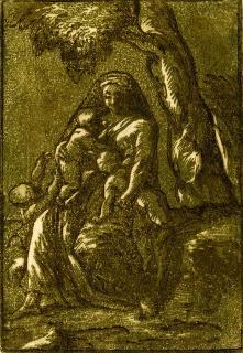
- ALU.1005.1 - CARITA' Atlante delle Xilografie italiane del Rinascimento
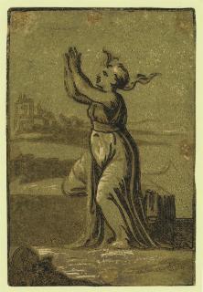
- ALU.1004.1 - SPERANZA Atlante delle Xilografie italiane del Rinascimento
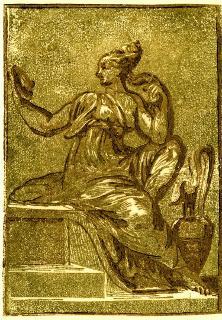
- ALU.1008.1 - PRUDENZA Atlante delle Xilografie italiane del Rinascimento
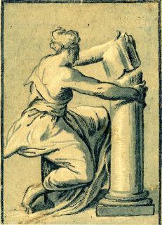
- ALU.1006.1 - FORTEZZA Atlante delle Xilografie italiane del Rinascimento
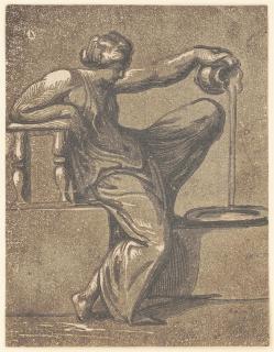
- ALU.1007.1 - TEMPERANZA Atlante delle Xilografie italiane del Rinascimento

